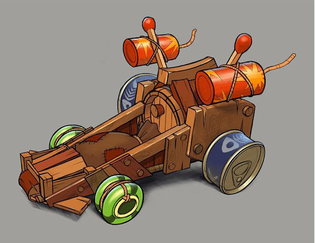
The second kart was slightly quicker to model as I could re-use some of the elements from the first kart, which also gave me reference points for scaling the rest of the elements to. I've executed the model using the same principles as the first kart, doing most of the leg work for texturing in the seperation of different elements through material ID's and allowing for unique surface details to be modeled rather than painted to keep the method of filling each element with a simple tiling texture intact.
 |
| 3dsMax Viewport With Skylight |
 |
| Wireframe |
 |
| Colour Ink Shader |
To get the most out of both the texture budget and triangle allowance, I've delegated certain details to be modeled and others to be faked in the texturing. For example the white planes highlighted below will be alphas featuring details. If I modeled these details instead it would meen adding further tiling textures to the list and would probably push me over the limit of triangles as well, so it's more efficient to keep these as projected details on planes, which from the distance I'm assuming the player camera will be from the karts it wont be a noticeable difference.

One scaling issue I had with this kart is with the wood barrel at the back. I'm assuming the concept artist was intending the barrel to look like it's sat on the kart floor, however if I did this with my model the pitch of the planks leaning against it to form the hut like shape was too high and made the kart look very back heavy in its composition, so I decided to have the barrel slightly sunken into the karts frame to keep the overall visual ratio's the same.

Knowing what to do with the rear view of the karts was also an obstacle, but I feel I've managed to keep the overall aesthetic for each upgraded version the same, making each iteration cleaner and more refined.


No comments:
Post a Comment