Friday, June 3, 2016

Stylised Shop Front - Texturing

To texture the model I’m using Substance Painter as a bridge program to Photoshop to quickly define roughness values between materials and blockout base colours.
 
Implementing this into a pipeline gives the texture artist much more of a head start on hand painting textures as the foundation for materials are already established and makes looking at the UV sheet easier to dive into.
 
 
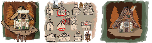
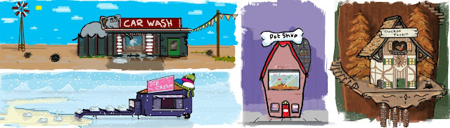
The texture process admittedly took me a while as I don’t have much practice under my belt with stylized painting. I’m striving for a similar aesthetic to the concept, simple in surface details but rich with the autumn color palette.
 
 
I found an art style whilst practicing painting and decided to execute the hole seen in this style as it fit the autumn tones I was practicing with. The style formulated from a mixture of bold colours and some more defined and painterly. The bold materials are used to emphasise the plastic elements of the cuckoo clocks original design and then the more painterly style is used to emphasise surface details and bring an overall unity to the world’s aesthetic style. I used the aesthetics seen in the indie game ‘Firewatch’ to help me explore my art style further and tie the scene together through colour temperature in a similar way to theirs. 


Stylised Shop Front - Modelling/Unwrapping

Modelling the shop proceeded quickly and it didn’t take me long until I had the whole thing fleshed out. Unintentionally the shop is very easy to mirror down the middle and made the process quick. I’ve also included the base from the first concept as I was initially happy with that element.


At this stage the shop was taking shape but I didn’t feel incredibly drawn to the visuals of the model, it was essentially a box. I decided to include some extra geometry to emphasise the functionality of the “Cuckoo Tavern”, adapting the model to suggest scenarios for transporting the beer to the tavern.
 
 
I have created some interest toward the rear of the building with the winch and storage scenario in the loft.
 
 
 Delegating some of the triangle budget to modelling the tiles individually added a lot of visual interest to the roof, as well as emphasizing the angles of the rickety chimney.
 

I implanted the idea that the acorn chimes that hang from the clock could be lifts for bringing up the barrels from the ground.

Adding the asymmetrical adjustment to the base meant that this could no longer be mirrored, which is a shame but no an essential issue as the base will be relatively undetailed and won’t matter if it’s scaled down in UV space to now fit both sides of the mesh.

Using my usual methods of Box Mapping and then stitching faces together the model was quickly unwrapped to 5 different UV’s (3 x 1024 and 2 x 512, with two 512’s spare for any additional assets) I’m now ready to start texturing.


Stylised Shop Front - Chosen Idea

I've chosen to go ahead with the 'Cuckoo's Tavern' idea. I'm attracted to the overall aesthetic of the scene and feel most pleased with the how the shops function, setting and colour scheme fell into place when deigning it. The essence of the shop being a re-purposed cuckoo clock for a tavern could suggest that the player is tiny or that the shop is huge. In the concept I've hinted at the idea of having the tavern situated up a tree with a spiral staircase leading up to it, this could be fun to explore and allows for scope in imaging how the rest of the environment would look, with possibly more shops in other locations of the tree.


From the original concept I've looked into other directions in which I could take the design. The final composition utlises my favourite bits from the thumbnails. In the final design I've also emphasised the the slopped roof and made the clock more of a focal point to give the building more of a fun and fatasised form.

Thursday, May 26, 2016

Stylised Shop Front - Exploring Ideas


For the third and final professional brief projects I've chosen to do the stylised shop front. I enjoyed doing the last Stylised Karts project but regretted there not being more creative control with the pre-established design. Subsequently I've chosen to do a project where I can have some fun with the design and hopefully try and execute the imagineered aesthetic through to the finished 3d scene.

The specifications for the project are that the model is built using 15k triangles and uses 4 hand painted 1024 x 1024 textures. With these constraints I will have to design a shop that's simple to construct but retains a visually interesting aesthetic.  


After looking at a wide range of instances where stylised architecture is shown, I formulated some designs. The designs are to no particular or finalised art style, I just wanted to explore some ideas using a unified painting method. I tried to use colour palettes that emphasised the mood and environment.


To conjure up my designs I relied on the overall novelty and comical value of the shops function to pave way for an interesting aesthetic. I thought about shops or services that exist in the real world and tried to put an alternative twist on them. Once I had the premise of each shop locked down I focused on emphasizing its architecture and setting to make each one into an exaggerated design, giving myself a range of potential ideas that I could see working as a 3d scene.


Realistic Basketball Court - FlyThrough


Gravity Karts - Sketchfab

Gravity Karts by JakWarne on Sketchfab

Stylised Prop - Gravity Karts, Texturing

Alongside my FMP I have also progressed a lot with the Gravity Karts and have already started the next model from one the professional brief choices.

To conclude the production of the Gravity Karts...

The texturing process for the Karts was pretty quick. Due to the art style of the Angry Birds being bold and simple in colour and surface definitions, I made textures that held simple pencil drawn details to suggest what the material is, using wide brush strokes to create subtle tonal changes on the overall surface. I also blurred the line details slightly to give some anti aliasing in the pixels, removing some of  the jagged edged look you get from using low res textures.
128 x 128
If the project was required to be made in UE4 I would have relied on Material Instances to change the Albedo colour of materials such as the wood, which is seen in various different colours in the concepts but is pretty much the same texture. However as i'm presenting the Karts in Sketchfab I will need to make multiple version of the texture in different colours, which is a shame for the efficiency of the model.

Unwrapping the models to the textures was probably the more time consuming side to texturing. Using the concept images as a reference for where the line details should be visible I tried to keep the overall pattern layout of each component the same, although it couldn't be achieved completely identically.


 Dividing up the UV's into different islands was useful to make the most of  texture sheets. 
After unwrapping all of the Karts to there textures and creating assisting maps for materials that needed it such as the metals, I prepared the models to import into Sketchfab. 


This was the first time I've used Sketchfab as a 3D model viewer, but it was fairly intuitive and easy to implement my PBR ready texture maps. For the presentation of the Karts I created a base for them to stand on and used the edge outline trick by duplicating the geometry, extruding each face out by 2cm and then flipping the Normals, so only the back faces are shown. This is an expensive trick as it doubles your triangle count, so it would only be used as a visual effect for Sketchfab, If it were Unreal Engine you would be able to do the same trick by using an outline material and plugging it into the 'Blendables' of a PostProcess volume.

I've tweaked the lighting and environment to emphasis the material properties and showcase the models and I'm happy with the results.

Rendered in Sketchfab