Sunday, May 8, 2016

Realistic Basketball Court - Final Fixes and Reflection


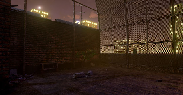
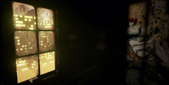
After fixing the problem on the glass (which was caused by a stray godray plane not being unchecked for casting shadows) I'm calling the environment done, as I need to move on to the other projects.

I've rendered a movie in UE4 using the matinee editor to show off the lighting and reflections that don't come across in the stills. I've also added small animated elements to some of the assets to bring the scene to life for the flythrough, I just need to find a way to upload it as my internet connection is terrible.

On reflection there are some things that I didn't fulfill with the environment and might still change if I have time. Firstly, the ladder on the side of the building was modeled for the intention of the player being able to climb up onto the roof, to increase the playable area, however the triangle budget didn't spread out enough to allow me to populate the roof with the same detail. Also having the roof as a playable area would mean I would have to create a believable way to fence the player in so as not to walk off the edge.

 This brings me to a related point that I'm not too happy with. Although the city surroundings were merely a backdrop for the environment, the sometimes visible horizon and deep surrounding void don't really promote a believable situ for the basketball court and make you feel a lot higher off the ground than intended.  

Another notable change I would make in reflection is that most of my props are small in scale and one of the cool things about the reference is the random larger objects found scattered around. Something I should have focused on modelling in hindsight, as I think the center floor of the court is lacking a focal point and most of the interesting compositions now come from the edges and buildings.    


Thursday, May 5, 2016

Realistic Basketball Court - Finalising the Environment

Since the last post I've made a lot of progress and I'd say i'm nearing finishing now.

Firstly I returned to modelling to make some more assets. Now that I had a base environment with a lighting and atmosphere set up close to my concept, I needed to start populating the scene with props to make it look more convincing of the vandalised and grungy aesthetic I'm striving for.

I've made some low poly assets of objects that are commonly found in neglected urban environments.


All textured with 1 x 1024x1024

Again, everything accept the rubble mound was textured in Substance Painter. Being able to quickly paint details through the Normals layer is great for giving assets damage and surface details. Obviously the results would be a lot more refined if I was to bake highpoly models down or open the workflow to Zbrush, but for non hero assets like these the results are good from Substance.

The rubble I created by overlaying different images of junk and debris and then making a height map for them. In Unreal I'm utilising a curved plane and Parralax Occlusion Mapping to give the effect of there being varying heights and non uniform edges to the plane.

 I've now populated the level with the props, focusing on the less interesting areas first and the places
where rubbish would naturally collect.


 After populating the level with all of the smaller props I didn't realise that I had gone over the triangle count and I had to go back into 3ds Max to reduce the tris where possible. However this time there wasn't anything that could optimised further without comprimising the meshes shape, so I had to delete some of the back faces from the cage mesh that you wouldn't see from player height and I reevaluated the placement of props, only adding them were it benefited the composition.

With some gaps to fill in the overall aesthetic of the level, but running out of triangles, I decided to make some assets from Alphas. I created a tarpaulin sheet to break up the silhouette of the cage and enhance the variety of scale, as at the minute most of the detail is on the floor.

The neon sign behind is also just an alpha, but I've masked off the writing to allow the emissive light to only show on that. The neon sign material is set to inject the emissive value into the LightPropagationVolume and on the StaticMesh I've ticked 'Use Emissive for Static Lighting'. This combined with the tarpaulin being set to a Subsurface material gives the impression of the sheet being slightly transparent and the neon sign having light properties.


Another alpha I chose to make was some vines. I felt like the scene definitely needed some greenery, even though it is set 10 stories of the ground.


This interior space felt a little dull before as there is nothing in it, however the vines have now added some visual interest and variance from the building on the other side of the court. Even though its the same visual style throughout I'm trying to make each space visually different in some way to allow for multiple points of interest. The vines in harmony with other materials and a coloured light give this space a slightly different mood to the other tones featured outside. 


With some planes I've made godrays for the windows. The material consists of just a smoke cloud alpha texture, the parameters being set to 'Translucent' and 'Unlit' and a calculation of the camera position to fade out the godray when you walk towards it. The effect works well in most cases but I've found that it's best to place it in an area where the player cant navigate around it to much as it can become skewed and break the illusion if looked at from a bad angle. I've seen a cylinder used for godrays before which works well as you cant see any edges, however for me a plane will do as I don't have the tri's. You can also add particle effect to the godray to get cool floating dust inside.


I've also added glass to the windows now, something I hadn't intended originally but it adds a lot to the visuals and only required a plane to make.


The PostProcessVolume is something I've been playing with also. I utilised the colour lookup table to tweak the levels and colour balance slightly, along with the other useful features in the settings such as, Global Illumination, AO and I've used the depth of field to help emphasize the fog by blurring the city lights.

Without PostProcess
With PostProcess
With everything becoming finalised, I'm about to do the final light bake then start to execute the final renders also. The only problem I'm having now is eradicating this shadow problem that appears on some of the glass panes, I'm not sure where it's coming from, it could potentially be light map issues but the other panes have the same spacing so I don't think it's that. The light bake settings I'm using are large and time consuming but are giving good results all over the level especially in the interior spaces, so i'm going to keep using them.

Sunday, May 1, 2016

Realistic Basketball Court - Lighting

After making separate UV channels for lightmaps, i'm now starting to create the atmosphere and mood i'm looking for.

I began using the standard UE4 set up with a directional light to act as the sun, but tweaking the environment and skybox parameters myself to try and get the time of day, as seen in the image below.


After referring back to my original images for the lighting and mood I've decided not to use the directional light source as it essentially carpet bombs the scene with light and I need more control over it. Subsequently I've changed to using a combination of spotlights (for emphasis of directional highlights) and pointlights for ambient glows, as this got me closer to the effect i'm striving for. Using multiple light sources is expensive to run, also multiplying light baking times and causing problems when they're overlapping, however the results are a lot nicer and allow for more freedom with aesthetic interests such as cool and warm tones and creating focal points.


The sky was difficult to get a good result with and I'm still not sure now if it really makes sense to have such a light sky for a night time scene. However I did try making the sky darker and it also didn't look right, making the level feel enclosed and didn't offer any contrast for the framework in front. I looked into how games like GTA portray their night time scenes and they're never pitch black but do seem to use a consistent amount of dark blues. Mine probably does need to be darker but i'm hoping it gives across the impression of light pollution from the city. I Think it's just a case of how else you portray that it's night with the surrounding environment, for example using glowing emissive lights, showing stars etc.

GTA V Screenshot
Additionally to the point and spot lights I'm using a skylight just to soften the shadows and give the slight glow to the reflective elements. I've added some simple surrounding buildings with emissive lights, the skylight s also helping here to give the impression that it's the glow of the city ambiently lighting the basketball court.


I'm using Exponential Height Fog and Atmospheric Fog volumes to further to aesthetic of illuminated city smog.


As you can see below there is some light bleading happening on some of the interior walls, i'm hoping this is just because of the lightmap resolution and I can irradicate it by optimising the padding on my UV islands.

With some pointlights position outside the windows I'm trying to get the effect of the city lights casting through, creating focal points, I'm also intending to make some faint Godrays to emphasise this further.

 More on the lighting soon...


Friday, April 29, 2016

Realistic Basketball Court - Materials in UE4

I've just finished texturing my architectural assets in Substance Painter. One thing I've noticed when importing my textures into Unreal Engine is the impact the Image Based Lighting Substance uses has on the aesthetic of the materials, metallic materials are especially more visually pleasing in Substance than in UE4.

The material properties look more crisp and constrasting in Substance. The Version in UE4 below is lit with a Directional light and a Skylight to try and emphasis the highlights. This is also with my combined Roughness and Metalness texture with unchecked sRGB in the parameters, as I know this can have an undesired effect on the glossy aesthetic.


It's my understanding that you can replicate the effect Substance has with a HDR in UE4 but it is only useful for reflections not so much the lighting.

To fix the low resolution brick problem from my last post I've made a tiling brick texture. However As I had put the effort in to making the plaster effect and overlaying graffiti and dirt onto the exiting bricks I decided to try a different method. I've utilised the Diffuse information that was overlayed on the old bricks in Substance and blended my new tiling texture underneath. Meaning I can keep the same unique crumbling plaster details and still have a higher res brick where its exposed.


To do this meant a little bit of extra work in the material shader with blending multiple textures and creating a mask where the new brick should be exposed. Also to make the tiling brick texture I had to reduce another textures resolution, which led me to try and optimize the metal shader of the cage.


The cage is now using a 1024 texture instead of the 2048 it was displayed with above, however i've used techniques such as Bump offset Mapping to retain some of the normal emphasis and overlayed a greyscale macro texture of surface details to get a similar results in the Diffuse and Roughness. The shader now gives the cage a much more battered look, with more contrasting detail highlights.

Exploring these different nodes in the shader graph led me get more adventurous with alternate techniques for improving shaders and the material realism outcomes.

This mesh Alpha uses the Bump Offset node for the illusion of being thicker than it is.

My plastered wall material now looks a lot more realistic thanks to Pixel Depth Offset, blending multiple Angle Corrected Normals.


I went back into Substance after integrating the textures into PBR shaders to change some things that I felt could look more visually interesting now I've seen them in a new light. One area i felt was lacking was the plaster, despite the graffiti and dirt it still lacked the grungy believability.

I didn't have any reference of the interior spaces from the basketball court I'm basing the environment off, but I had been following the generic principles of an abandoned building... messy and destroyed. After looking at some more research of abandoned buildings I realised that in a lot of publicly used facilities plaster is normally painted bright colours. So I added some paint to break up the large plain of white plaster, along with a painted vent detail and more green mold. This rework surpisingly made a massive difference.


I've also learnt about adding parameters to shaders to be able to tweak them in realtime, which is frankly awesome and a lot more convenient for making aesthetic choices for material properties, so now most of my textures have a set of nodes for controlling customised parameters such as macro detail amount or Normal intensity multipliers.


 Having control over the aesthetics through more complex material shaders is very useful but also
expensive. Detail enhancing nodes such as POM are great for giving the impression of surface detail on an otherwise flat mesh, without having to add geometry. However if nodes like these are used excessively throughout your shaders it can be expensive to calculate and frame rate will take a hit.

The scene is looking as I had hoped so far, with the derelict feel coming across through meshes and materials. I'll need to work on the atmosphere next and start to create and build lighting effects.


One issue i've since had is with the mesh material below, because the mesh alpha is tiled a lot to get the right density, when the player is far away the mesh becomes a solid material occluding all the background. This I discovered is due to the Mipmap levels, they were previously set to 'FromTextureGroup' I've now set them to 'NoMipMaps', which in these close quarters is fine because the texture doesn't really need to be downscaled for optimization purposes. This fixes the issue a little but I don't think it can be solved fully as it's just the density that's the issue.