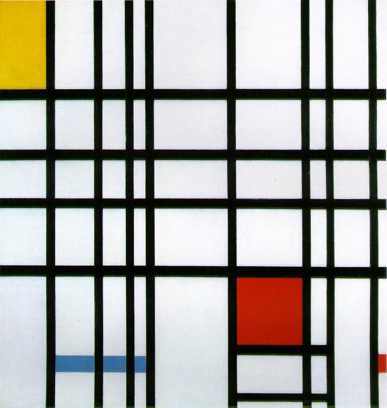
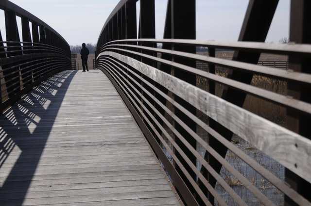
It can be utilized to create a minimalist image. Seen in Piet Mondrains work.

Some play with it to create a juxtaposed images as seen in Giuseppe Arcimboldo's work.

In my personal opinion it is best utilized when considering the 'rule of thirds'. A technique that I used to use in my A level photography course. You dissect your view into a three by three grid and place the subject of the image in at least one of the four intersecting lines in the grid. These four white dots symbolise the compositional sweet spots for the subject to sit in, which normally allows for a visually pleasing image. A totally centered subject is sometimes ok but an offset subject is a lot more pleasing and readable.

The masters knew and applied established rules of composition, discovered and employed over a long period of art history.When you read into the history of composition and how its been applied over the ages, you quickly get an understanding of the elements composition is broken in to.
One element of visual composition is rhythm. Any pattern is formed with rhythm, rhythm of positive shapes, negative shapes, lines, colour, or specific items or individuals. For example, the rhythm in an image could be the placement of a crowd, the crowd could be carrying swords so then there could be a rhythm to swords, the swords might be placed at angles to one another and spaced evenly or oddly, but there would still be a kind of rhythm to the eye.
Every thing can posses a rhythm and if that rhythm is unorganised, unpleasant, or crowded without thought it can let a piece of work down. Just like a musician, if his music is too fast paced it may seem unorganized, the audience may not be able to keep up and just hear noise. If a piece of art or a cinematic scene is unorganized and objects are placed randomly it can become like the music, badly contrasted, not much impact, unsightly, badly juxtaposed. I mentioned that colour can be a rhythm too. colours generally should be used through out a piece of work, to tie the piece together in mood and lighting.
Similar to rhythm, too much colour can be distracting. Unless the artist controls the vivid colours to create a noise effect, as seen in Monet's pointillism paintings.

Another key element of visual composition is the focal point. Focal points can be established through use of lighting, colour, positioning, detail/and or depth of field. Focal points can be a result of simple perspective, environmental concept art is a perfect example of this. When creating a piece of concept art you have to think what draws the human eye in an image? In a dark image the greatest source of light or reflected light will draw your eye. Characters or objects can be illuminated. A change of colour can do the trick, a different coloured light, a brighter clothed character, a different form of shape that stands out amongst the crowed, a different orientation such as a character facing the opposite direction, or simply an object in focus in the middle of an image slightly out of focus.The focal point can be enhanced by utilizing the level of detail in the scene. From simply lowering the level detail from the contents of the image surrounding the subject, you enable the subject to naturally stand out. However this is another element that needs to be balanced or you risk creating attention to other things in a scene and it can make an image look cluttered or confused. Be careful how much detail you put into an image, you should choose wisely where you want your viewers eyes to be drawn.
Also perspective is a useful tool. Well placed perspective can work with the objects in the scene, creating lines for the eye to follow leading toward the subject or focal point. You can use perspective to your advantage to create mood.

If you place yourself lower than your focal point, say your looking up at someone, that person can now appear strong or intimidating, but you place your view above them and now they appear small, they appear weak. If your viewing a monster and make your image looking down on him he wont seem very frightening. Perspective is something i need to work on in my visual design work. I've been told i place my horizon line to high skewing the scale and proportions of the contents in my scene.
There is so much to composition, composition is the building blocks to any piece of work, the language with which we read and compose it. It seems composition is really all about artistic judgment it almost looks like a natural ability, a careful eye, and a lot of time on the work.
No comments:
Post a Comment