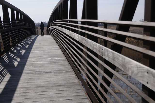
The level designer is the back bone to a games success. They weave an invisible paint through the canvas of the game, infact, they build the canvas for which the fabled game artists will paint on. They're the muse, the god, the mother of what we call a game. The level designer will be concepting the game long before the artists, he or she will be imagining how this game is going to feel long before any lighting artist. They concept the gaming experience. Similar to the game designer, whom I would name the father, they are an architect of the reality experienced by the player through the game. In many ways the level designer is also a story teller, an architect, an artist, and an interior designer.
A level designers role is to create the composition of the level maps, leading not an observers eye but a players actions. Actually it’s a little of both. The way a player navigates a game level may seem like free will, depending on the genre, but in actuality choice is an illusion. In games and life. A level designer purposefully creates a way in which to traverse a level, cues for guidance, various strategic mechanisms to aid their willed effects. A bit like the film 'Inception' they are the architect who creates a maze.
A level designer ‘blocks out’ a level, large representative shapes controlling the flow of player movement. This block out begins with the first demo, art pass. They have the knowledge to control your actions before you’ve made them, and the tools to affect how you will feel. This block out will become a playable test level as is, without textures, detail or any form of completed object. The goal of this stage is to asses how this game is going to feel, can they create what they intended, do they like the feel of what they're about to invest a few years producing.
So a level designer needs a clear idea about what they're creating, its good to have some real life experiences, to have travelled the world, analysed what makes a place special and more importantly, easy to navigate. Simple experience of real world streets and locations help too, places you've been to base street layouts on, knowing what makes a place or route memorable and time you've got lost and why, and a massive collection of personaly taken resources.
With this the level designer should be able to make good decisions about placement. Building agame level is like building a town. A good game level will stick in a players mind clearly, be accesable, not be confusing. A player should never be able to get lost, this is usualy done through landmarks and recognizable places, focal points. Focal points really make a game level special, and this is where it starts to sound like composition in art. Thinking back to all those things i touched upon in my previous post about composition, it might apply in more ways than one. Composition directs an observers eye through focal points, rythmns, lines, shapes, light…. In level design a path could be the line, leading you to, where? Shelter from gun fire dotted about, or even events to take place in a level, can be the rythmn, as well as actuall building/object placement. Shape could be shilohetts or repetitive assets, and light is a great attractor to a player.
A level designer needs to know how to communicate, and he needs to know his audience. Knowing your audience would mean you have a good idea of what experiences themselves they're likely to have had, what sorts of scenarios and puzzles they're bound to know the solutions to, how they will essentialy play.
A part of communicating is through the environment itself. Buildings speak a lot to players. Buildings can be used as part of the level design, areas for specific purposes. An architect builds a building for aesthetics and a purpose, a clearly definied purpose dictates the ways in which he will build that building. The level designer much the same, the level being his building, will use buildings themselves as cues to a purpose, want to know the purpose? What is the building? What are they normaly used for? That area probably has some relation.
Asside from buildings, a level designer should have a good understanding of how the world speaks to someone, what makes something feel grand, what makes a player follow along side certain walls, what makes a player pause for thought or back track.Before a level designer can even step into the program of their choice though they need to ground a few things. An established game type, the audience, an idea of what happened in the level before the player enters, a clear idea of the purpose of the level - whats its goal or focus, plot point, what abilities will be available to the player, how big will this map be, what do you want to be most memorable about it, how will the player be rewarded, what is the experience focus is it atmosphere fun fear awe, what is the desire of the player at this stage and will you fullfill or deny it.
Once established they can get to problem solving. It always starts with pen and paper. A top down view of a map, abstract shapes and respresentations, calculating the flow of movement within the map. The flow of players, the flow of enemies, the triggers and locations for events, ideas about guidance, the flow of routes, the paths, the blockades, the shortcuts. Once they have the foundations set and a good idea, it's time to block out the BSP! Or in laymans terms, add large blocks of solid walls to experiement on your rats with. Once its made, time to play. After the play test, if alls gone well, its time to hand it over to the artists. Often a level designer will provide a blocked out level to artists just to paint over and imagine what could be there. Now its their turn to deal with composition and lighting. Of course being mindful to whats been set in place by the level designer.
As the project goes along the level designer is never interirely happy with they're creation, a level can always be made better but dealines restrict perfection. However there is always time to realise new patches or levels after release, revisions will be made, new levels created and tested, some even deleted or rearranged.
Sources i used:
level_design_workflow_tutorial
wheres_the_design_in_level_
http://www.gamasutra.com/view/feature/131462/wheres_the_design_in_level_.php?page=2
This blog features projects I'm working on for the Game Art Design course at DeMontfort University, Leicester.
Monday, November 25, 2013
Sunday, November 24, 2013
Task 14: Elements of game design, part five: planning and concepting
When talking about planning and concepting i'm sure i'm not the only game art student who, whenever a new task is set, mentally makes a long list of all the awesome things they want to put into their game environment and then end up only adding half of it to the final scene, due to poor planning and extravagant concepts. Concept and planning are words that i've heard frequently since first starting art at secondary school, and for all too good a reason, they're the foundations of any successful piece of work produced, be it a 3D scene or a piece of concept art.
From the planning perspective my flaw is time management, it's the first thing that comes to mind, as we're told the time we have is ridiculous. There have been days when I get up with good intentions and mentally lay out what I hope to accomplish, and it often results in either spending too long on one certain aspect or just stretching it out throughout the day and having a classic procrastination. For example, the trash project in which we had 4 weeks to complete, it is so basic a task that I had the following planned out: Week 1, model the mesh and gather pictures, Week 2. unwrap and texture, Week 3 maps and any other improvements, In the third week i was still working on my maps and tweaking the diffuse. Not that I view certain modules over others, but there have been times where I need to prioratise which is the most important task at the time and which requires more time for it.
Next to time management, the other factor which is crucial to me is reference, usually for 3D for textures and so on, there really is no point starting out a piece with nothing to work from, even the most creative of us must have a muse or inspiration.
Thumbnails are the center point to all our 2D work, the more the better. They are brillaint references that we use to record the atmosphere of a location and helps us decide what we want for our final. Whilst they are a quick and simple way of working, I still find myself unhappy with just having blocks in my thumbnail even though that is generally all that could be needed, having said that, I have somehow managed to restrict the level of detail I used to get into, I only wish the same could be applied for finals. Normally i know what i'm going to draw as my final straight away, so i find myself rushing my thumbnail sketches. This is because i know my final peice is the image i'm going to put most effort into, thumbnails are for me to learn, final peices are for other people to judge.
Going to Loughborough train yard was profitable because not only did it give my chance to get some cool rust and grime textures, it also helped with my perspective which I have been meaning to improve.
One thing which I havn't done much of in the planning process is record scraped ideas or duds, mainly out of fear that they aren't worthy of being displayed to all to see. On the other hand, I feel as if I don't produce enough thumbnails sketches.I understand that doing preporation sketches is essential to better your quick mark making skills, but i'm too much of a perfectionist, it's hard for me to do quick sketches and leave them looking simple. If i do them i want them all to look like final peices, which takes too long, which i why i put all my energy into my final peices. Definatly a planning process i need to balance out.
Elements of game design, part six: visual composition
In art you will hear the words 'Visual Composition' used a lot. It is mentioned a lot because it is very important. Composition in anything is important, whether it is a painting, a house interior, a film clip or a game environment.The composition of something in simple terms is how the elements depicted are laid out and displayed. A well thought out composition well attract your eyes and will be repeatedly pleasing to look at. Composition is very powerful, it helps convey a long list of factors i.e. The mood, lighting, narrative, scale and depth. It is also very fun and technical to experiment with, i play with it in both art and photography.
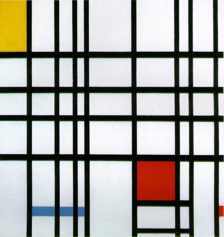
It can be utilized to create a minimalist image. Seen in Piet Mondrains work.
Some play with it to create a juxtaposed images as seen in Giuseppe Arcimboldo's work.
In my personal opinion it is best utilized when considering the 'rule of thirds'. A technique that I used to use in my A level photography course. You dissect your view into a three by three grid and place the subject of the image in at least one of the four intersecting lines in the grid. These four white dots symbolise the compositional sweet spots for the subject to sit in, which normally allows for a visually pleasing image. A totally centered subject is sometimes ok but an offset subject is a lot more pleasing and readable.
The masters knew and applied established rules of composition, discovered and employed over a long period of art history.When you read into the history of composition and how its been applied over the ages, you quickly get an understanding of the elements composition is broken in to.
One element of visual composition is rhythm. Any pattern is formed with rhythm, rhythm of positive shapes, negative shapes, lines, colour, or specific items or individuals. For example, the rhythm in an image could be the placement of a crowd, the crowd could be carrying swords so then there could be a rhythm to swords, the swords might be placed at angles to one another and spaced evenly or oddly, but there would still be a kind of rhythm to the eye.
Every thing can posses a rhythm and if that rhythm is unorganised, unpleasant, or crowded without thought it can let a piece of work down. Just like a musician, if his music is too fast paced it may seem unorganized, the audience may not be able to keep up and just hear noise. If a piece of art or a cinematic scene is unorganized and objects are placed randomly it can become like the music, badly contrasted, not much impact, unsightly, badly juxtaposed. I mentioned that colour can be a rhythm too. colours generally should be used through out a piece of work, to tie the piece together in mood and lighting.
Similar to rhythm, too much colour can be distracting. Unless the artist controls the vivid colours to create a noise effect, as seen in Monet's pointillism paintings.
Another key element of visual composition is the focal point. Focal points can be established through use of lighting, colour, positioning, detail/and or depth of field. Focal points can be a result of simple perspective, environmental concept art is a perfect example of this. When creating a piece of concept art you have to think what draws the human eye in an image? In a dark image the greatest source of light or reflected light will draw your eye. Characters or objects can be illuminated. A change of colour can do the trick, a different coloured light, a brighter clothed character, a different form of shape that stands out amongst the crowed, a different orientation such as a character facing the opposite direction, or simply an object in focus in the middle of an image slightly out of focus.The focal point can be enhanced by utilizing the level of detail in the scene. From simply lowering the level detail from the contents of the image surrounding the subject, you enable the subject to naturally stand out. However this is another element that needs to be balanced or you risk creating attention to other things in a scene and it can make an image look cluttered or confused. Be careful how much detail you put into an image, you should choose wisely where you want your viewers eyes to be drawn.
Also perspective is a useful tool. Well placed perspective can work with the objects in the scene, creating lines for the eye to follow leading toward the subject or focal point. You can use perspective to your advantage to create mood.
If you place yourself lower than your focal point, say your looking up at someone, that person can now appear strong or intimidating, but you place your view above them and now they appear small, they appear weak. If your viewing a monster and make your image looking down on him he wont seem very frightening. Perspective is something i need to work on in my visual design work. I've been told i place my horizon line to high skewing the scale and proportions of the contents in my scene.
There is so much to composition, composition is the building blocks to any piece of work, the language with which we read and compose it. It seems composition is really all about artistic judgment it almost looks like a natural ability, a careful eye, and a lot of time on the work.
Reflection on 1st year and expectations for 2nd year
Now that im back in Leicester and subsequently back into my Game Art course I feel the need to remind myself of the challenges first year brought and how I can utilize what i've learnt to apply to situations in the second year.
The first year was definitely a roller coaster ride of learning and experiences. I started off knowing next to nothing about games design and finished the year feeling like I could easily make a small game. However despite the amount I had learnt there was still more to take on board and think about. When I had time to step back and think over the summer I realised I had only really learnt a fraction of what's needed to be a game artist. I was really looking forward to being involved in the course again, it felt like I had been away from an actual job for 3 months over summer, because on the course you never get a minute spare, my head was always focused on work and what needs to be done next and the suddenly we had gone home and I had nothing to stress about. I like stress, stress is what keeps us motivated to get off your ass.
Learning from the first year I had prepared myself for what was to come. I repeatedly reminded myself that this year is going to be a lot harder and therefore i'm going to need to work a lot harder. Ultimately the main lesson I learnt from the first year is timing myself. If I hadn't of allocated/sacrificed certain days to doing work then I wouldn't have finished anything on time, and even then i'd still be up all night working the night before hand in. there is undeniably a lot of work involved in the course, but then when I take a step back and think about it, I love doing the work we get. When I walk into my flatmates room's and they're moaning about the essay the have to do on marketing and management, I suddenly don't feel like a can validly moan about having to design a homemade weapon for a game, compared to what they're doing mines frickin' awesome, so i'm always reminded why i love what i'm doing, it is the tool to allow creative people such as myself to thrive.
In the second year I hope to improve on the advice I received last year, i've gone over all my feedback sheets and I mainly need to improve on presentation and professionalism of my 3d work, naming assets correctly and to imagine I was to send the 3d environment to my boss, would I be happy with it and more importantly would he be happy with it. In terms of visual design work i'd like to learn how to paint digitally, as it speeds the concept and design process up a lot when creating an asset. In critical studies the outstanding element I need to work on is my ability to physically present work in front of a class. I am not naturally a confident person, being the center of attention has never been something i've wished for, but it's definitely something i should adopt in order to be professional and employable.
From sharing the same computer room as the second years last year, i've had a sneak peak into what I can expect to be doing this year, and i'm excited to get started. The element i'm most looking forward to experiencing in the second year is the introduction of working in groups to create assets and environments. I think i'd like the professional approach to it, I would be forced to work efficiently with other people, sharing ideas and design processes. Also it would allow some element of role play into the way a real game art team functions, creating and sharing assets and concepts between artists would allow me to progress on how I present work both visually and physically.
Bring on year two...
Subscribe to:
Posts (Atom)